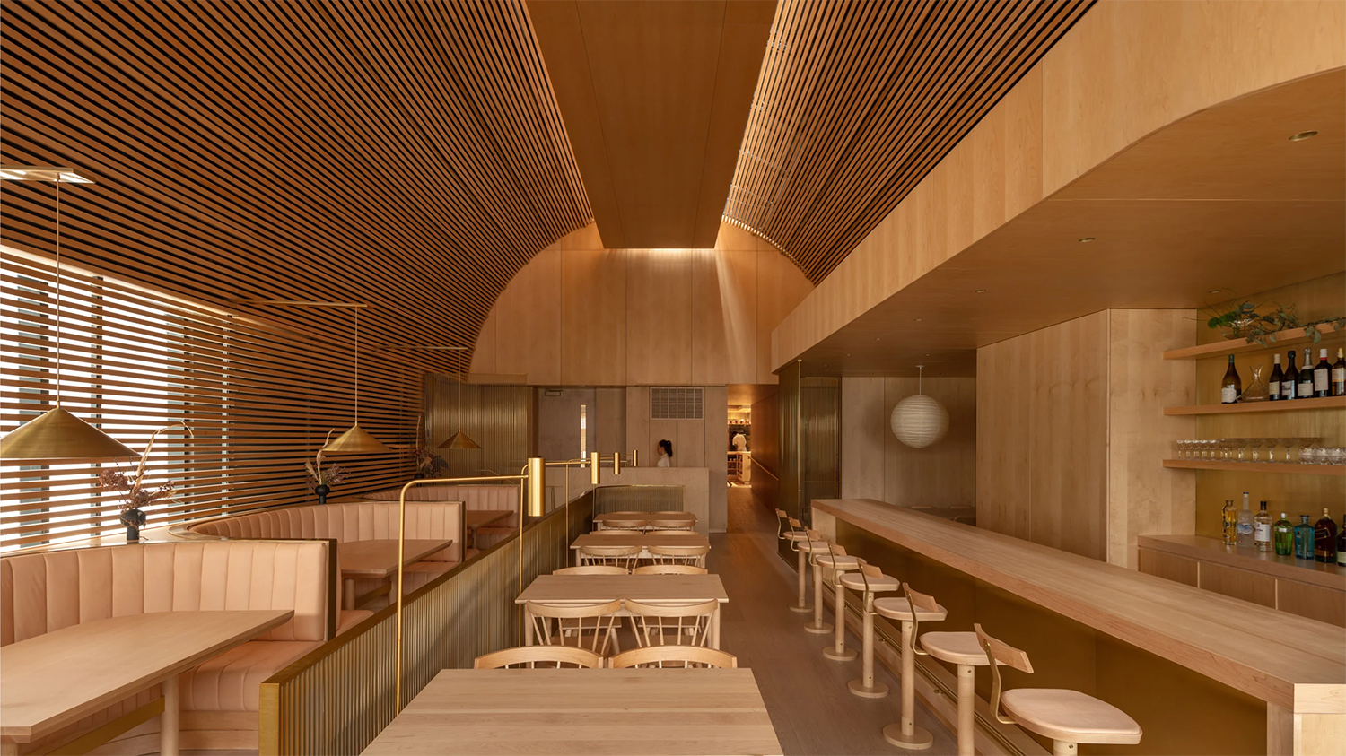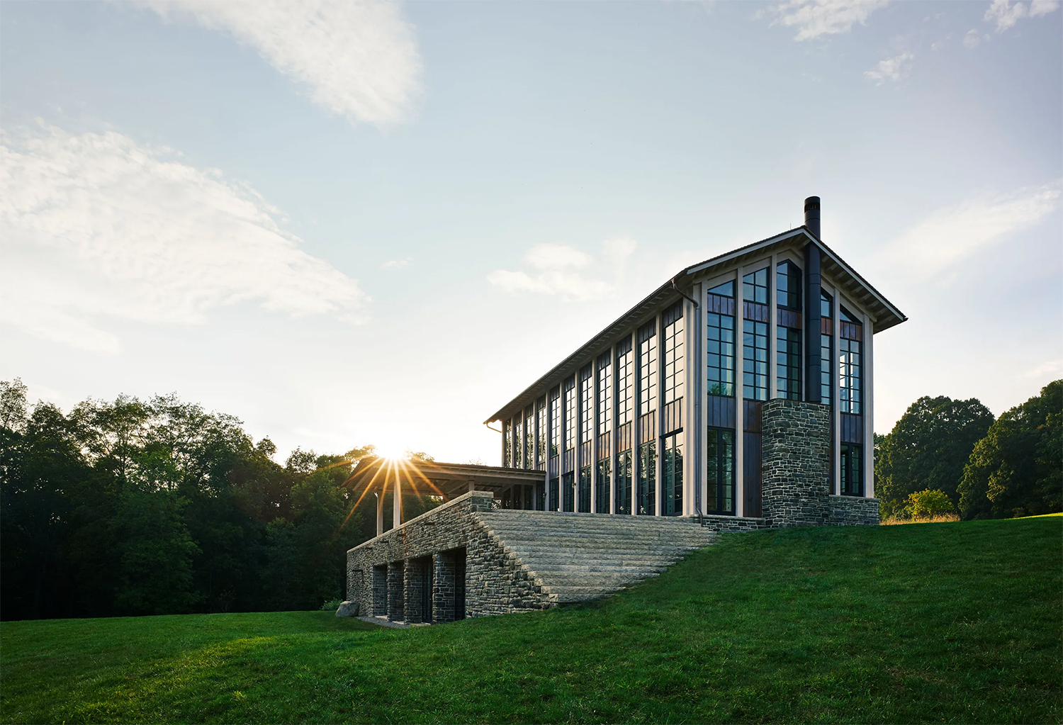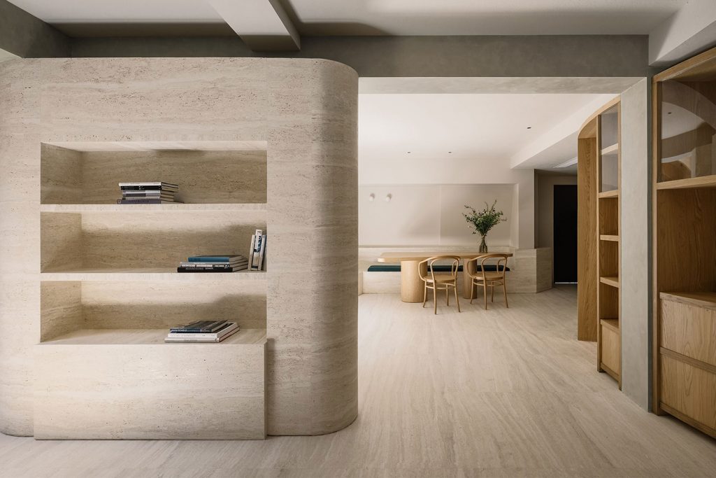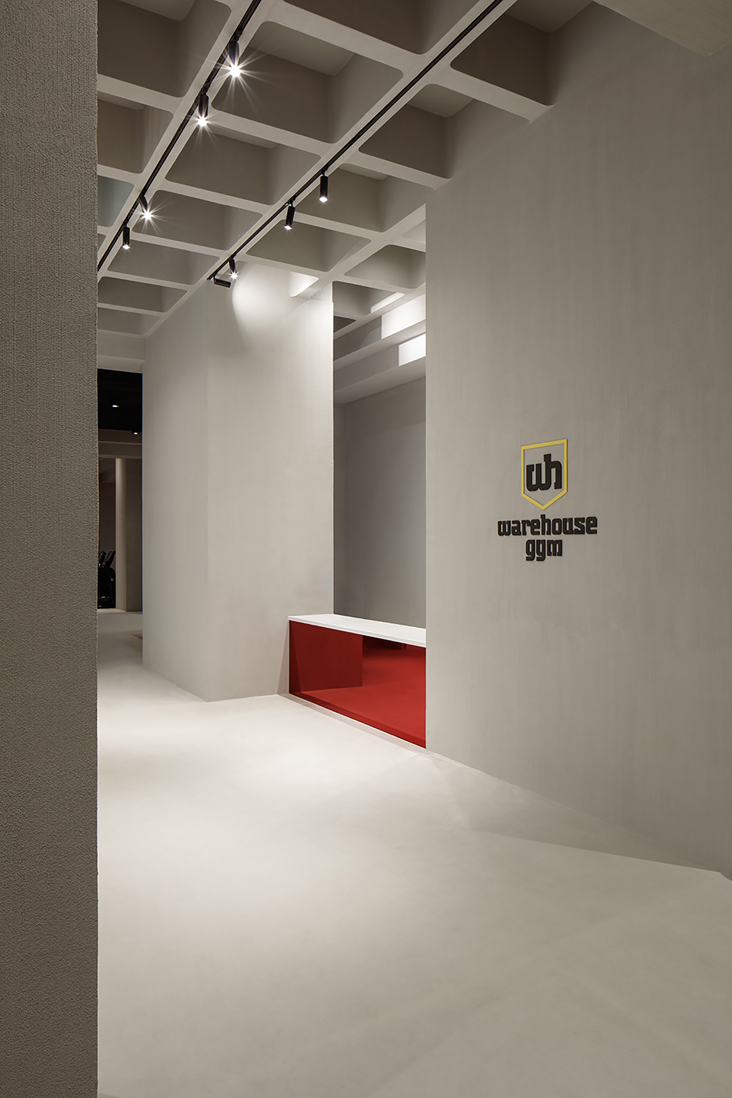
Those endless rows of black equipment. The overall feel of a gym. We are hoping that one day, someone will disrupt this segment and decide that not all exercise equipment has to look like oil-rig machinery channelling destruction and torture, not health and well-being.
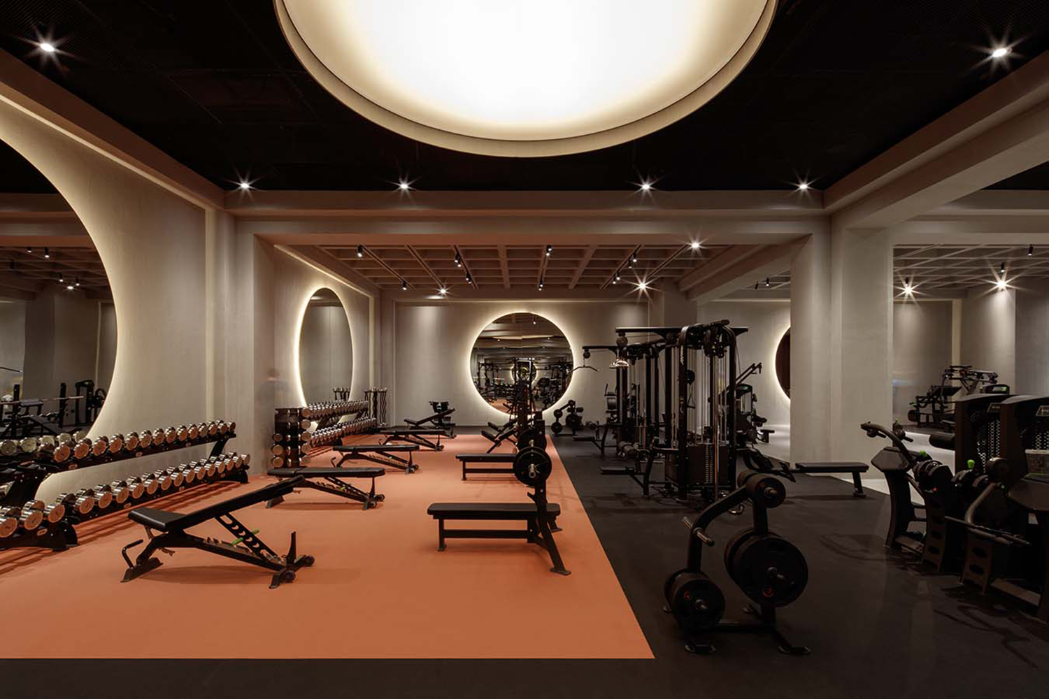
Maybe we are the only humans whose idea of health and fitness doesn’t include torture or brutalist leanings. And yes, we hear those of you who’d like to send us back to our spas and wellness studios and stop whining. We will gladly go. But before we do, we feel there must be a middle ground somewhere. Even if we are, on occasion, ready to push and demand a bit more of ourselves than the tree pose, does it have to be in a cavern of doom? And does all of the equipment have to look so ugly? And no, we are not talking about feminine and masculine here. We are talking about balance and appeal.
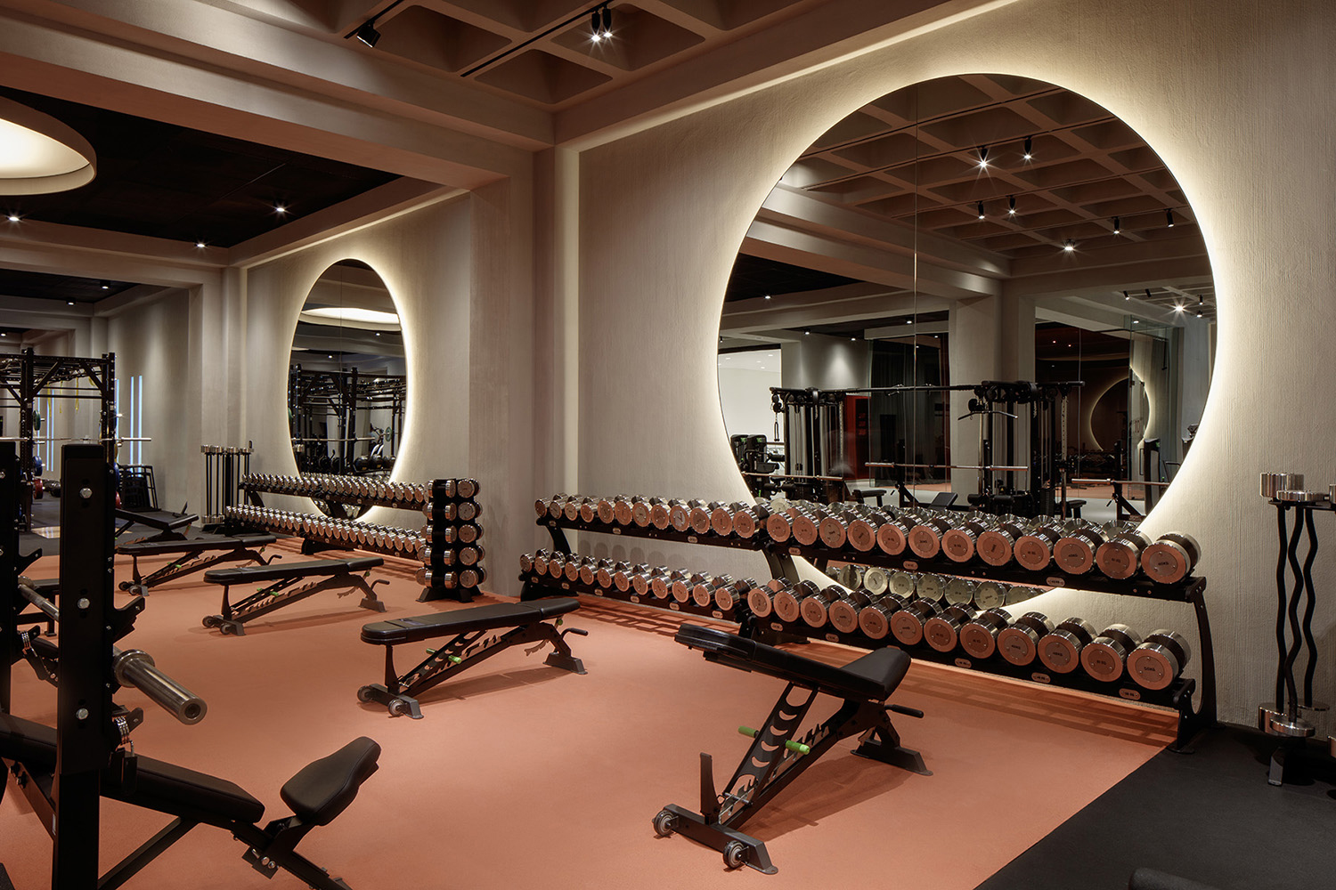
This is what we were contemplating when we ran, once again, across the images of the Warehouse Gym located on the second floor of the Springs Souk shopping mall in Dubai. This 1,200 square-metre (12,916 sq.ft) gym is part of a chain of eight Warehouse Gyms in the Emirates, each with its own vibe and its own offering of services.
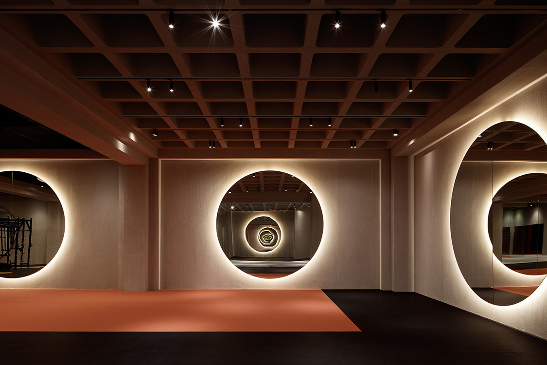
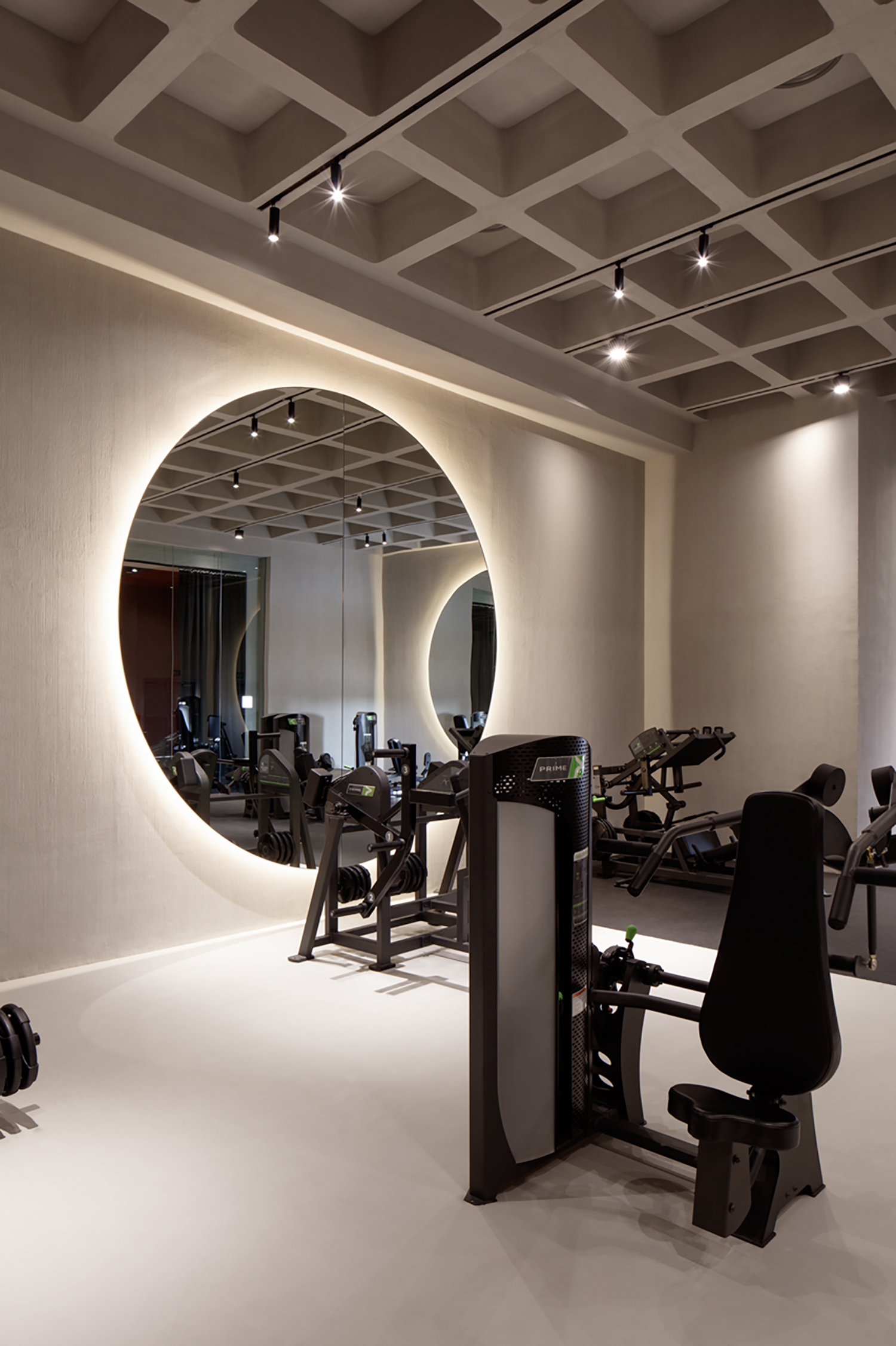
As adverse as we are to excessive striving, we feel there is merit in this design completed by Dubai and Montreal, Canada-based VSHD Design founded by interior architect Rania Mahmoud Hamed.
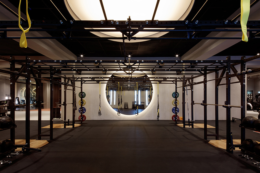
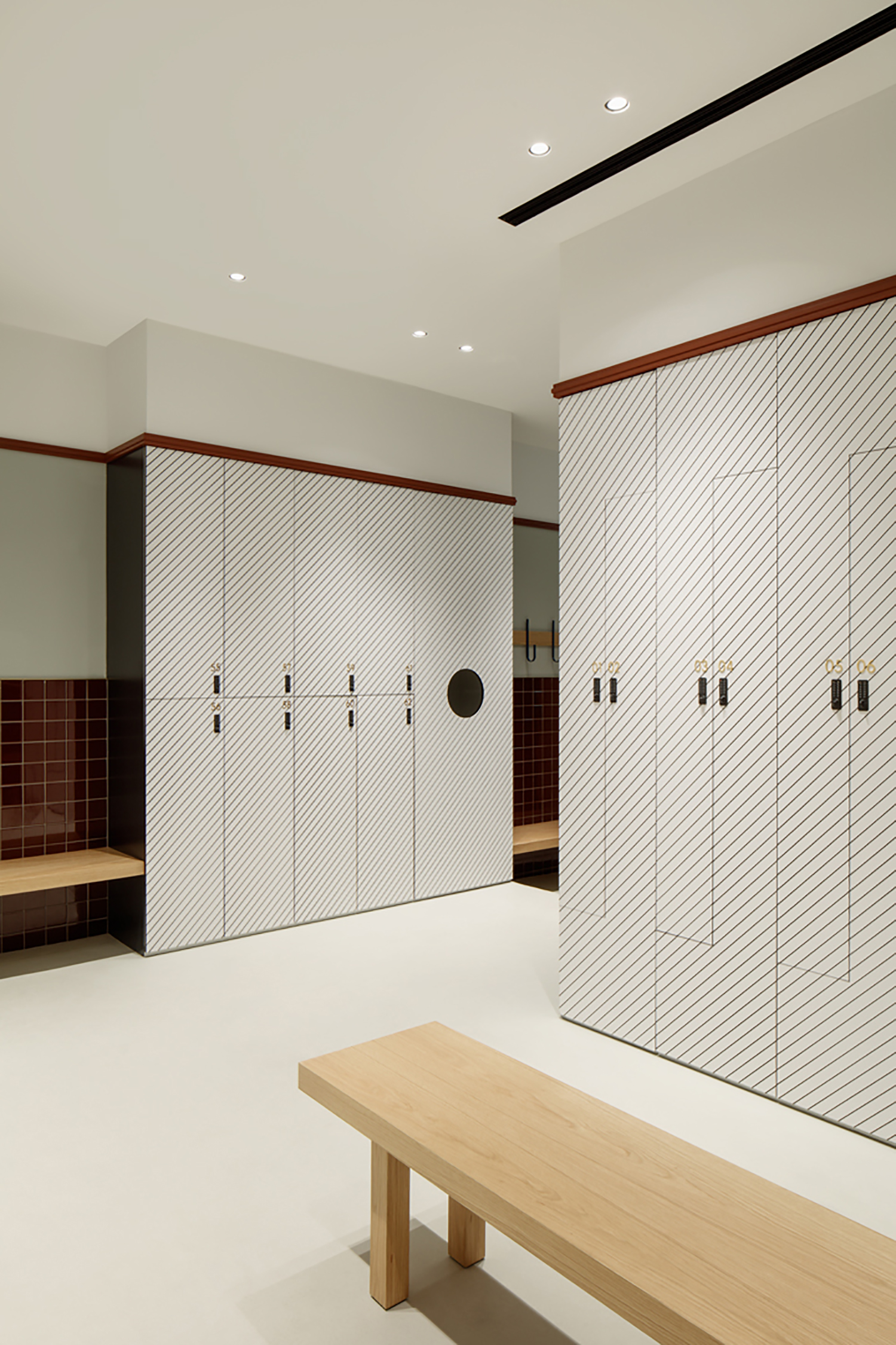
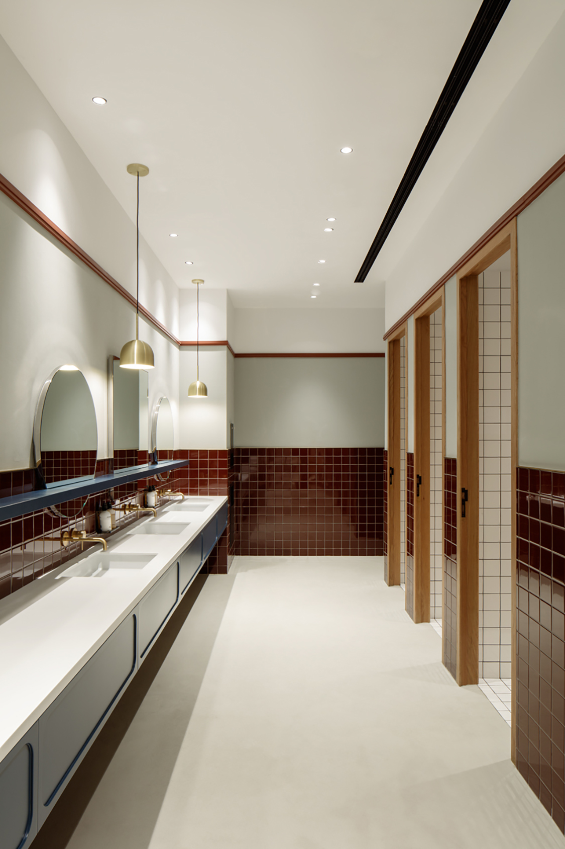
We do like the idea of employing just a few simple design components – round shape, subtle lighting, mirrors and orange-red accents – and sticking to them. We also love that all those features help lean the experience a bit further away from the black abyss of sweat and suffering and closer to fun and enjoyment. We also love the shower and change-room area with its streamlined, minimalist tiling, black modern fixtures, wood-trimmed doors and wood seating. This is where we see some of that balance. These auxiliary spaces offer a calm atmosphere and a spa-like feel.
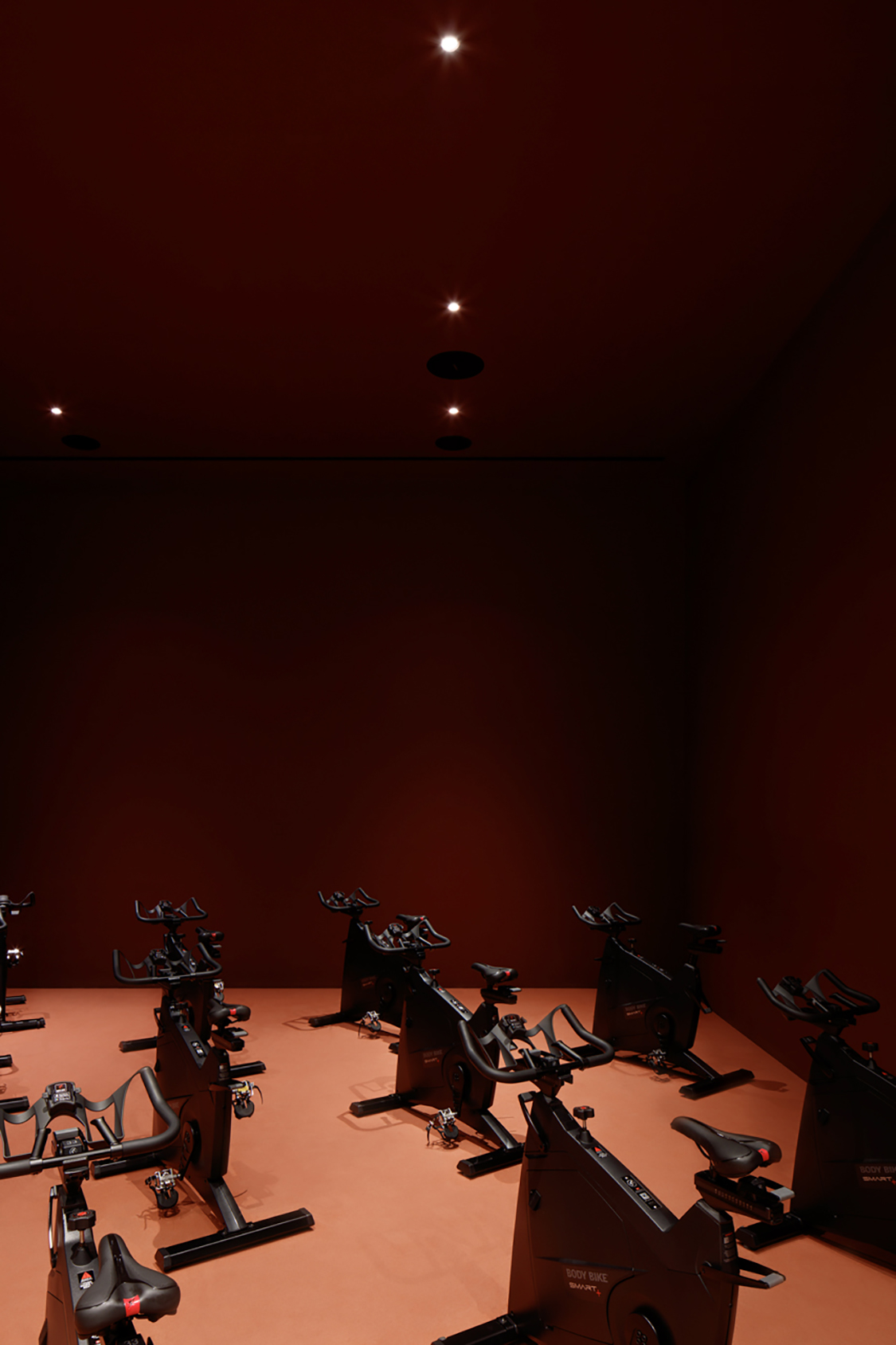
However, the description of the gym on the shopping mall website clearly states that the purpose of the design concept was to entice the patrons to sweat to loud music surrounded by bright colours and a sense of a night-club-like buzz. It also refers to amplified energy and no rest, so their immediate target clientele clearly needs this. But there is apparently also a yoga studio, so perhaps there is a mat for us as well.
Overall, we really love the flexible lighting program that follows the trend that has moved gym-lighting from starkly neon-lit spaces to ambient lighting that can be modified, re-focused and dimmed, and that functions as a clear design element. We also like the clever use of round mirrors that multiply the reflections in each other. Tuija Seipell
Images: Oculis Project /V2com


